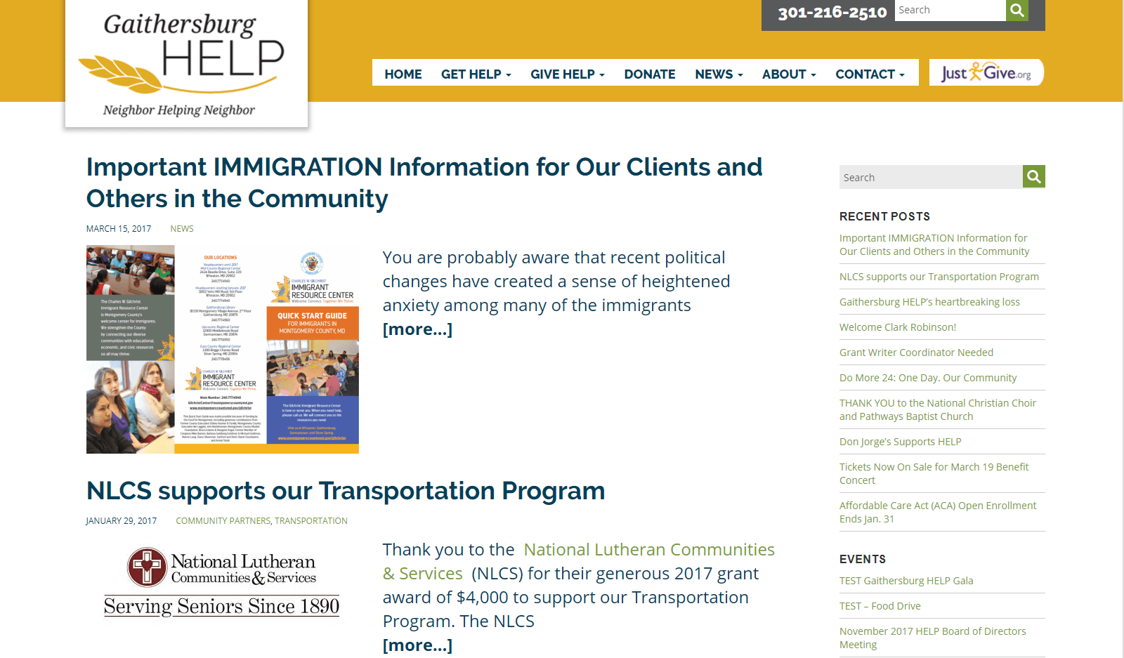
Gaithersburg HELP is a non-profit organization that supports local residents in need by providing food, transportation, and other services. Their website was outdated, and their users were having trouble finding the information they needed about available services, or how to donate time or money. They wanted an update to their website that would make it easier for clients to find what they needed, and they wanted their site to be accessible across all devices. Take a look at some Before and After photos.
Home Page Update
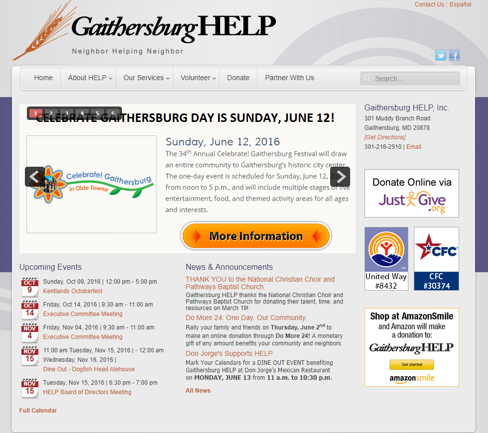
Before, the home page was too crowded, and users couldn’t easily figure out how to get what they needed. There was nothing eye catching that illustrated who they were and what they did.
After, the home page reflects their services, and users can choose from easy designations (“Get Help” vs “Give Help”) to find the right information. The images scroll, and each represents one of their services.
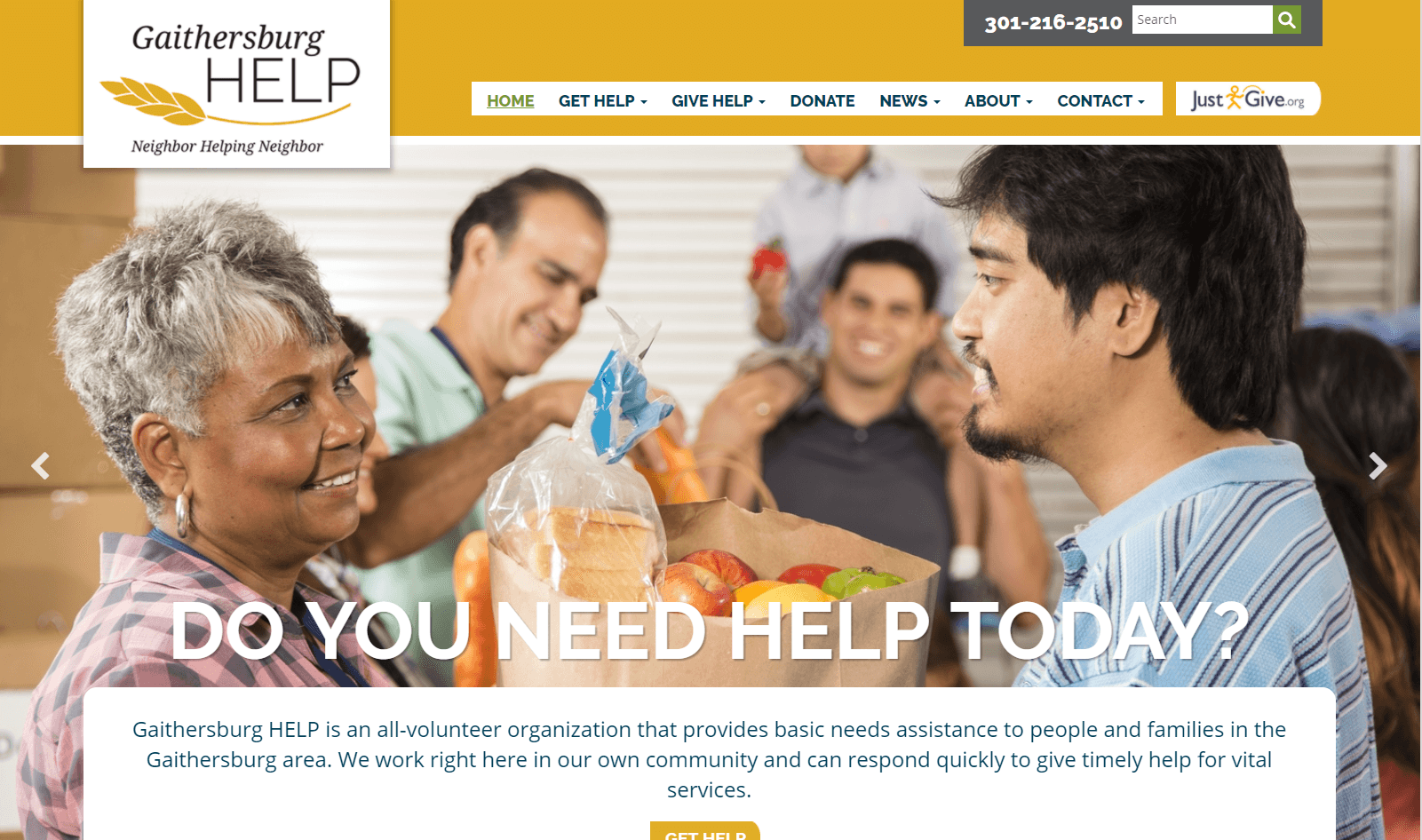
Home Page AFTER
Making It Easy to Volunteer
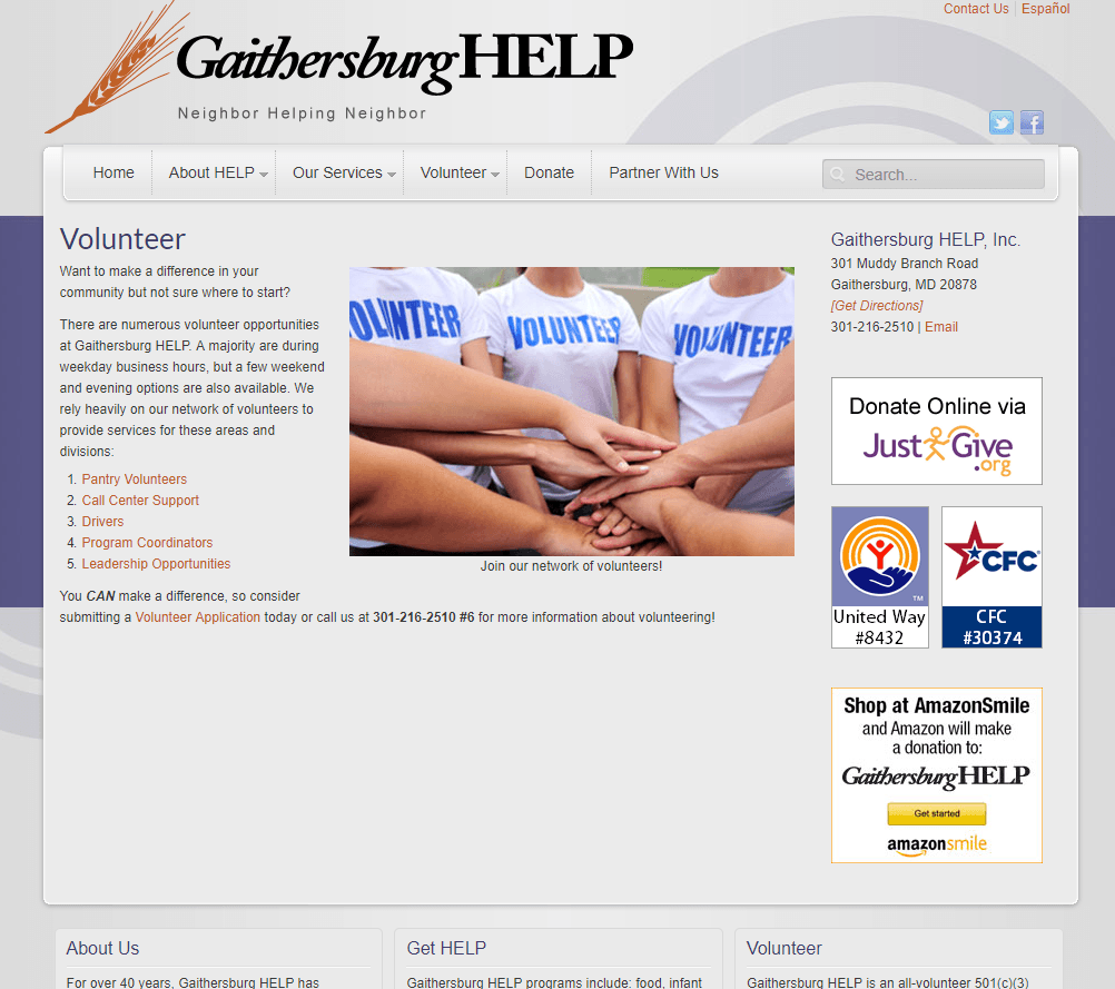
Before, the volunteer page wasn’t very inspiring, and users had to read a text list to pick out the information they wanted.
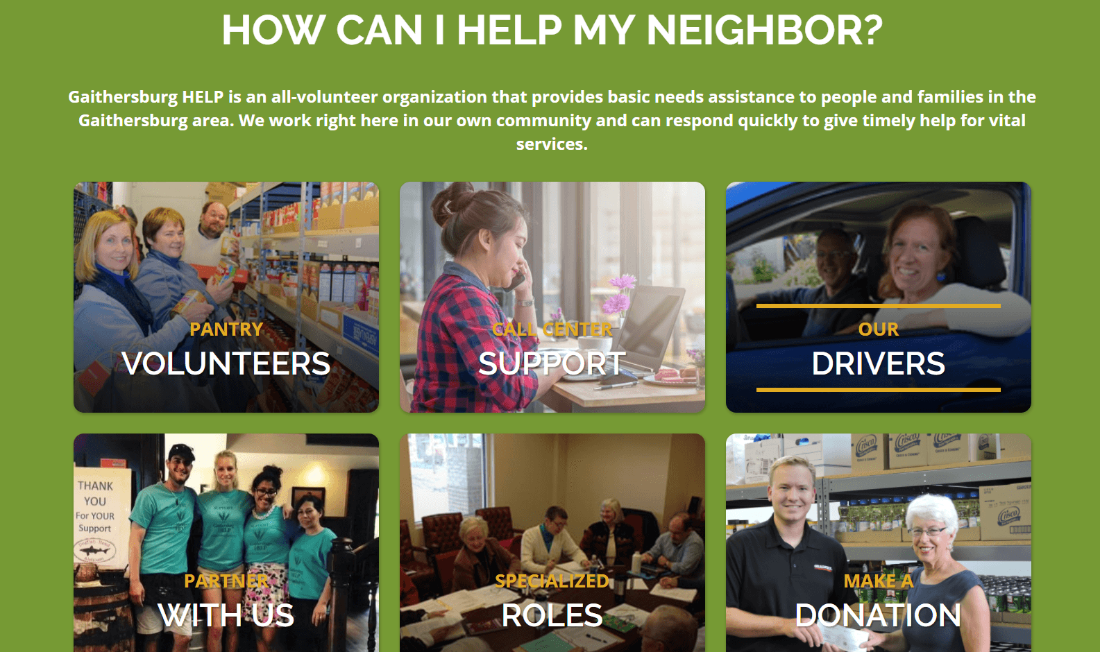
After, users can scroll down the home page to find out what kinds of volunteer help is needed, and click on the image to get to the right page. The same information is available as part of a dropdown menu.
Making the News Feed More Useful
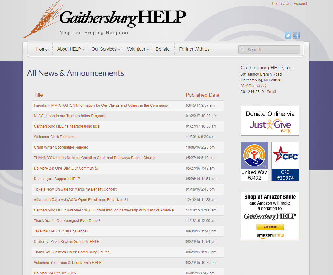
Before, nobody wanted to scroll through a list of news and announcements to find what they needed.
After, we updated the look of the news feed page, and added categories and tags to all their archived posts so that users can find more about their topic of interest.
We’re thrilled with the way the new site turned out. Check it out here: www.gaithersburghelp.org

