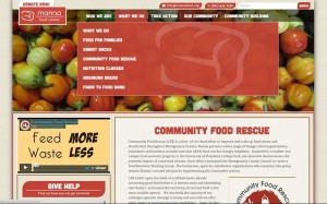
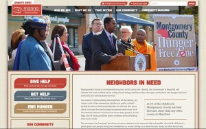
This project was a redesign/redevelopment of an outdated, static site that the client had major challenges keeping updated. It came out wonderfully and you really must visit the Manna site!

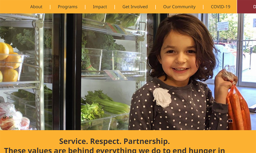
We started from scratch with the design, focusing on textures and images that authentically represented the client. You’ll notice a subtle burlap texture in the background and the watermark of the logo icon in the drop-down menu. The client supplied us with some fabulous images to work with. And we built a structure perfectly suited to the content, which is substantial to say the least.
We are very proud of the work here, not to mention the amazing work that our client does on a daily basis. It was an honor to work with them and we hope they’ll use the site to great effect for years to come!

