Why is responsive design important?
Because of the proliferation of tablets and smart phones with varying screen sizes, and, more importantly, because such a growing number of people are using them to search and surf on the web, it makes sense to implement responsive design. There is no better way to take control of your image and your message on all devices than to develop a responsive site.
[pullquote align=”right” cite=”” link=”” color=”” class=”” size=””]There is no better way to take control of your image and your message on all devices than to develop a responsive site.[/pullquote]
How does responsive design work?
When we talk about optimizing your website for mobile and tablet devices, there are two main ways to go about doing it:
- Creating an alternate, mobile-friendly version of your website; or
- Programming your site to automatically reformat to the size of the user’s browser – also known as “responsive design.”
Creating an alternate mobile-friendly version of a site is a simpler process and best used for high-traffic web applications, such as Facebook and Google. In fact, there are automated tools you can use to do it yourself – although we recommend working with a professional (whether it’s Web Mobile Image or not).
A responsive site, on the other hand, can be coded to work for any number of browser sizes.
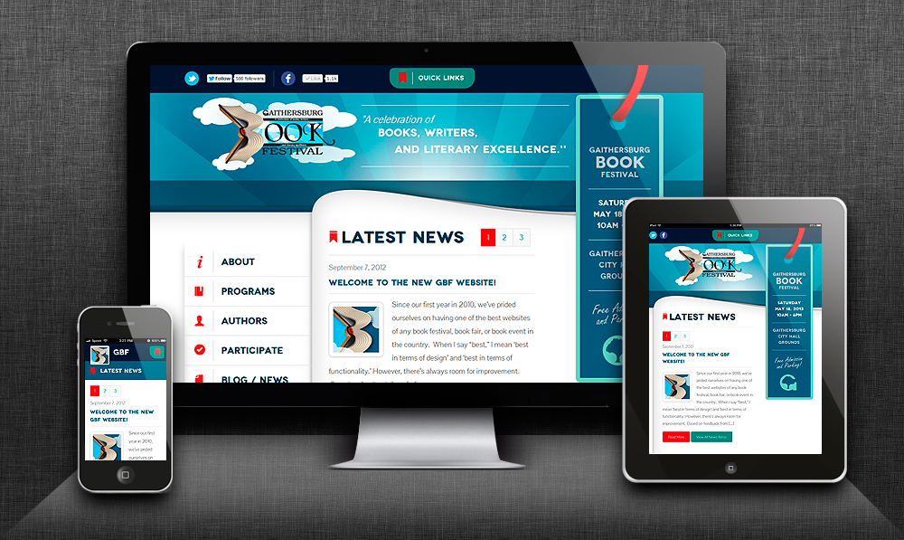
Take a look at the picture of the Gaithersburg Book Festival site, which we designed. As you see, there are three screens on display; a desktop, a tablet, and a smart phone. They’re all displaying the same web page, but that page is coded to format differently for each device.
For example:
- On the desktop you see a menu on the left side, which is not present on either of the other screens. This is because that menu takes up too much real estate for the small screen. We chose, instead, to use different navigation tools for the smaller screens.
- The bookmark, a design element that displays the date, time, and place of the Book Festival, is only present on the desktop and tablet screens. It also takes up too much real estate for a smart phone screen and would’ve been a major distraction.
- The main Gaithersburg Book Festival logo in the header of the desktop and tablet screens has been replaced on the smart phone display by a smaller icon, formatted specifically for the small screen.
- The main navigation menu on the smart phone has moved to a pop out menu on the right. (picture below)

What responsive design has allowed us to do is to make sure that the Gaithersburg Book Festival’s info and design elements work for the user, regardless of how they’re accessing the site. We can control which graphics are displayed (e.g., smaller graphics look better and load faster on smart phones), how the navigation menu works and where it’s displayed, and take advantage of different functionality on different devices. For example, we can include a “click to call” button or GPS navigation on smart phones. We can include larger-scale pictures and video on the mobile and tablet versions.